Wednesday, 29 October 2014

Gender representation: To what extent does advertising construct our ideas of gender?

I have selected gender representation as my topic for Context of Practice. I chose this question because as a women it affects me substantially. There are endless examples of sexualisation of both men and women in the advertising and these ideas of the realities of gender are often false. 

I currently only have initial ideas about the areas I want to explore as it is such a vast subject. I have considered focussing my project on men in particular as often the impact of advertising on men is ignored.  I have also considered the recent he for she campaign which was made well known by Emma Watson. It was suggested in my crit that I design advertisements for this campaign. 
I also took away the following points from my crit and the crits of others-
-Question of inequality?
-The perception of women
-Consider a category of advertisements e.g. perfume
-Is it possible to communicate the same message adverts do currently without having a negative affect on body image?
-Sexism in cleaning adverts
-What is feminism?
-Adverts that are supportive to women e.g. career women and mothers
-Diet Coke advert; male sexualisation
-Younger generation aspiring to be women in media; create new role model? 
-Look up The Male Gaze


To kick start my research I have gathered a variety of books covering both genders media and body image:
Gauntlett, D (2008) Media,Gender and Identity. An Introduction, 2nd edn., Abingdon: Routledge.
Wykes,M and Gunter B (2006) The Media & Body Image, 2nd edn., London: Sage Publications . 


Crewe, B (2003) Cultural Production and Producers in the Men's Magazine Market, 1st edn., Oxford: Oxford International Publishers .

Wednesday, 22 October 2014

History of Type Lecture

The lecture began with illustrating the importance of type. This was shown through a series of powerpoint slides showing the aims of the lecture. Each slide contained the same information but different typefaces and designs. This immediately showed how important type is in practice and the difference it can make:


We began to learn about the basic elements of typography and I looked their definitions up- 

Meta-communicationCommunication that indicates how verbal information should be interpreted; stimuli surrounding the verbal communication that also have meaning, which may or may not be congruent with that of or support the verbal talk.

ParalinguisticsParalinguistics are the aspects of spoken communication that do not involve words. These may add emphasis or shades of meaning to what people say. Some definitions limit this to verbal communication that is not words.

Kinesics-the study of the way in which certain body movements and gestures serve as a form of non-verbal communication.

Here we can see how the elements of type can change its communication and how the elements can be used incorrectly: 


As you can see, type is incredibly important and defines what is communicated. A calligraphic, ladylike font is highly inappropriate for an Iron Maiden concert and communicates the wrong message.

Then we began to explore the history in detail. It is clear that some of the most used type today was created centuries ago. These typefaces appear to have a timeless quality. I feel that this is down to their readability.


We looked at where the earliest writing began. Many modern typefaces are based on the first roman letterforms found on buildings, architecture and more. 


Around 1450 the age of print began with printing presses allowing the process of creating type and writing to be much quicker. From this, more typefaces were developed and types began to be put into categories: 

Sans-serif typefaces where a favourite of the modernist graphic designers. They believed that form followed function and they felt that sans serif fonts achieved the communication and readability required. I feel that the simplicity of modernism was taken too far with the creation of typefaces such as Bayer, an all lowercase typeface. I feel that this can make communication difficult! 

Of course, how could there be no mention of the 'perfect' typeface helvetica. Again, a favourite of modernists. This was supposedly ripped off by Microsoft for this reason: 


Another reason to hate Microsoft is that the designer of Comic Sans worked for them! 

Then came the creation of internet explorer. This laid the foundation of standard fonts for browsers worldwide- including arial and comic sans...

Design is subjective, but I feel we can all agree that comic sans is a disaster font! 


Wednesday, 15 October 2014

Study Task 2 - Modernism & Postmodernism OUGD401

Modernism

Fridolin Müller, for the Eidg. Schützen­fest Zürich (Swiss Fed­eral Marks­man Fes­ti­val) ,1963

This is a clear example of modernism due to the images components- a basic black circle and red helvetica type (a common typeface used by modernist designers). Function is clearly prioritised over form in this image as the required information is clear and legible; attention is not drawn away from the important details. The posters elements appear to be organised as either centrally orientated or to the left of the poster. 

David Carson, National Theatre 50th Anniversary Poster, 2013

David Carson was a pioneer of postmodernism and in this poster his rule breaking is difficult to miss. The text is completely illegible and difficult to read (or even find!). A mass of colour and shape explodes across the page in a manner that would be viewed as unnecessary by modernist designers. The image also appears to follow no grid, or any organisation for that matter. Form is evidently following function. 

Thursday, 9 October 2014

Visual Literacy Lecture - OUGD401

After a very interesting lecture based on visual literacy, I felt quite overwhelmed with all the information and terms. I therefore made a mind map of all of these. This helped me understand and visualise all the principles that were explained during the lecture. I will find this helpful to refer back to in the future!

Analysis of Advertisements - OUGD401 - Study task 1


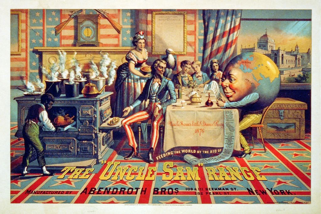
With a modern eye ‘The Uncle Sam Range’ advertisement -created in 1876 by Schumacher & Ettlinger - can seem complicated at first. It seems unusual for the product being advertised (in this case an oven) not to be centre of attention. However, the outstanding political message is hard to miss.
The company’s American routes are made obvious by a number of visual ‘clues’. Firstly, the red, white and blue colours seem to absorb all objects around them.  Not to mention the stars and stripes swallowing up the carpet, curtain and walls. All this is representative of the American flag. Other symbols representative of America are used such as eagles and guns. On closer analysis, the clock shows dates (1776 and 1876).This acknowledges and celebrates the 100 years of America’s independence. The font on the dinner table seems extravagant like this potential American lifestyle shown. Furthermore, the classic uppercase western font displayed at the bottom of the image in shining gold, reflects America’s power, wealth and authority. The painting style of the advert also reflects a regal feeling. There is a clear sense of patriotism and pride in America that cannot be missed.
So, why is the advert more focussed on America than the product itself? Judging from the imagery used, the idea is that the world has come to “Uncle Sam’s Little Dinner Party 1876”. This sounds positive at first, but if you look closely at the receipt held by ‘the world’, the racism and mockery towards other countries comes to light. Also, the use of the slave shows America’s attitude to the rest of the world- despite the abolishment of slavery in 1833. America appears to be boasting of its cultural superiority whilst belittling other countries. The advert is suggesting that if you buy this cooker, you will be living the American dream, as illustrated in the image itself.
The viewer imagines this American dream. No matter who you are or what background you have come from, you will succeed and be prosperous in America. The target audience is questionable. It could be aimed at the middle class, illustrating to them the extravagant lifestyle that they could lead if they were to purchase the oven. If aimed at the upper class, it simply competes with the other cookers on the market and comforts them that their ideal lifestyle will be possible with the product. It is likely that the image is aimed at men, as a man is the centre of the image and all is revolving around him. This was the culture of the time.

In 1915, a poster with many similarities to Uncle Sam’s, was produced by Savile Lumley.  The poster is far more simplistic. The illustration is set in the future and it shows a father and two children in what appears to be the sitting room. The advert communicates that the daughter is asking her father the question written at the bottom of the poster - “Daddy, what did YOU do in the Great War?”. The poster aims to make the viewer feel a sense of guilt and therefore guilt trip men into becoming soldiers.
 The question can be answered in two ways, however, the stern look on the fathers face suggests that he did not put himself forward as a solider. This forces the viewer to imagine the potential consequences and embarrassment if did not become a solider. The imagery also promotes being protective towards your family- if you don’t go to war, you are not protecting your family!
The use of a script font for the caption expresses the innocence of the child and makes the advert feel more personal. The ‘YOU’ is capitalised and underlined- this combined with the father looking directly towards the viewer makes the advert very direct and almost commanding. The son in the image clearly looks up to the army as he plays with his war toys. The viewer can imagine the boy explaining how he would join the army, so why didn’t you daddy? All of these tools only increase the pressure to become a solider.
There is an interesting use of colour in the advert. Both males are dressed in warm colours , yet the girl who is asking the question is dressed in colder blue colours. This may represent the coldness women would feel towards men if they were too cowardly to join the army.

The image shares the same patriotism as Uncle Ben’s. The curtains are layered in red roses, a symbol of England. Likewise, another symbol of England – a fleur de lis – covers the chair. In both images there is a shared sense of pride, in yourself or in your country.  There is a common aim to persuade the audience in terms of sale. Uncle Ben’s aims to sell the product, whereas you are guilt tripped into selling your life for the second image. There is also an offer of contentment or promise that is visualised in the image, the viewer naturally wants to aim for this. Finally, both images appear to be aimed at men. The male is always central and this reflects the time period and culture when these images were produced. In modern day, it could be argued that more pressure is on women, but in these images it is clear that in the past, an immense amount of pressure was laid on men.